Tye Robinson · Senior UX / Product Designer
AT&T Security Profile — UX Case Study
AT&T Security Profile
I led UX design for a security profile experience used by tens of millions of customers. The work focused on account recovery, two-factor authentication, device control, and risk notifications, turning a fragmented flow into a guided, confidence-building experience.
The goal: increase protection feature adoption, reduce lockouts and support calls, and make security settings feel understandable instead of intimidating.
- Role
- Senior UX / Product Designer
- Company
- AT&T
- Timeframe
- ~12 weeks
- Team
- PM, Eng, Legal, Security, Accessibility
- Platforms
- Responsive web & native app
- Tools
- Figma, Miro, User research tools
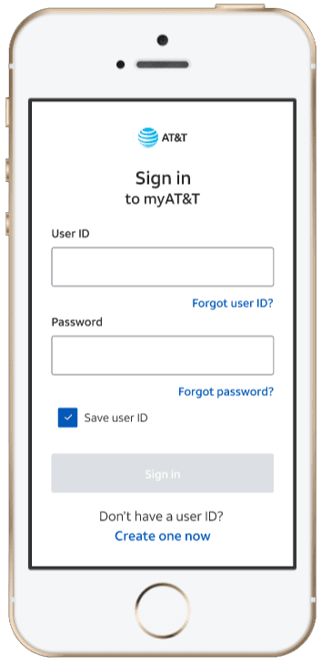
2FA activation
+18%
Increase in customers turning on two-factor authentication.
Account lockouts
-25%
Fewer lockouts and recovery-related support calls.
Scale
100M+
Customers impacted across web and mobile channels.
Problem
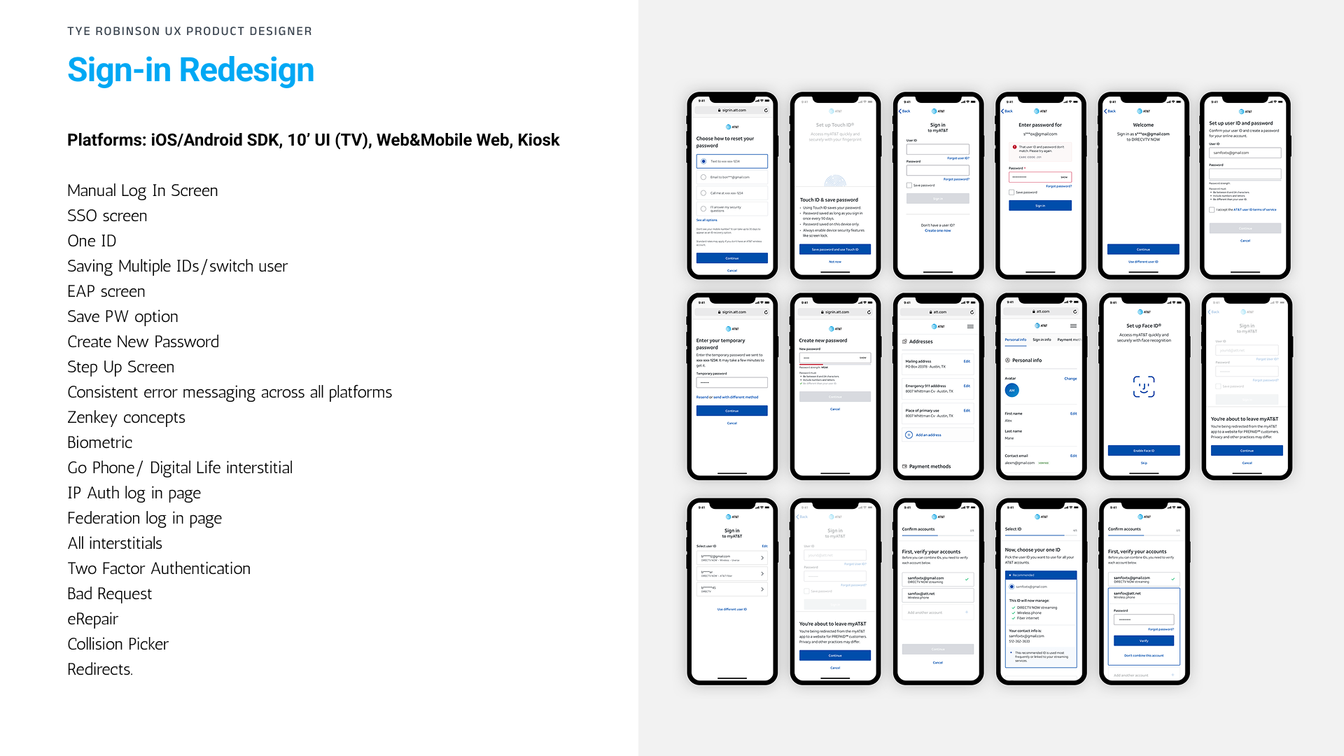
- Customers weren’t sure which security features they had turned on or what they did.
- Account recovery flows felt confusing and inconsistent across desktop and mobile.
- Security jargon and fragmented UI patterns caused drop-offs and mistrust.
- Support teams saw high volume for lockouts and password reset issues.
Objectives
- Give customers a clear “security health” view for their account.
- Increase adoption of 2FA and stronger recovery options.
- Reduce friction and confusion in recovery flows.
- Align UI and patterns across platforms while staying compliant.
Research & user insights
Mixed-methods research to understand expectations, mental models, and failure points in security flows.
Methods
- • 1:1 user interviews
- • Large-scale survey on security habits
- • Funnel & drop-off analysis in recovery flows
- • Heuristic audit of current experience
Key personas
- Diane (64) — privacy-focused, tablet-first, cautious about change.
- Marcus (33) — small business owner, mobile-first, time-poor.
- Sara (25) — tech-savvy, switches devices often, wants control.
Insights
- • People don’t read security as a feature list; they want a simple status.
- • Trust increases when explanations use plain language and show impact.
- • Users need gentle guidance, not walls of text, at each sensitive step.
Design approach
01 · Frame
Map the system
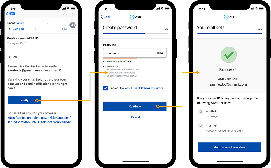
I mapped end-to-end journeys for login, recovery, and device management, aligning with security, legal, and support teams to capture constraints and edge cases.
02 · Design
Flows & states first
I focused on decision points, error states, and progressive disclosure, pairing visual hierarchy with microcopy that explains “why this matters” in plain language.
03 · Validate
Prototype & test
High-fidelity prototypes were tested with target users to validate understanding, confidence, and time to complete key tasks, then iterated with engineering feedback.
Key design solutions
Security health dashboard
- Single place to see overall protection status across account and devices.
- Clear indicators for what’s on, what’s off, and what’s recommended.
- Contextual “Why this matters” links to build trust and understanding.
Guided 2FA & recovery
- Simplified 2FA setup with step-by-step guidance and clear device copy.
- Recovery options presented in priority order with pros/cons in human language.
- Reduced dead-ends by clarifying what happens if you lose a device or SIM.
Device & session control
- List of trusted devices with clear actions to sign out or remove access.
- Risky activity surfaced with inline recommendations, not just alerts.
Education woven into the UI
- Short, scannable explanations at decision points instead of separate FAQ pages.
- Icons, color, and layout that communicate risk level without overwhelming the user.
Key screens & flows
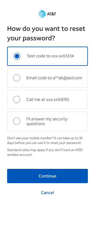
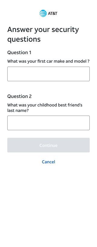
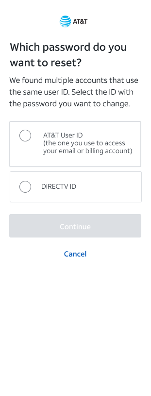
Three key recovery moments: delivery choice, security verification, and choosing the account to reset.
Outcome & reflection
Beyond the numbers, the most important shift was how the experience felt to people. What used to read as “a scary security page” now feels more like “a clear account security dashboard I can understand and act on.”
Getting there required tight collaboration with security, legal, and engineering. Those conversations kept the design grounded in real risk, policy, and system constraints, while still pushing for plain language, clearer hierarchy, and a more human tone.
If I had more time, I’d keep going in two directions: smarter education and stronger reassurance—more personalized guidance based on risk profile, plus push/SMS confirmation throughout recovery so people feel confident their account is protected.